10 Best Candlestick Patterns Ranked by Backtest Performance: Do Candlestick Patterns Actually Work?
Whether candlestick patterns actually work depends heavily on how you define your entry and exit rules, as academic research shows mixed results ranging from no added value to statistically significant predictive power.
While some candlestick patterns show a measurable historical edge in specific market contexts, they are not inherently reliable trading signals without systematic testing, trend filters, and a clear accounting for transaction costs.
In this article, we show you the 10 best candlestick patterns. We used our own proprietary code to rank all 75 candlestick patterns.
Related reading: 75 Types of Candlestick Patterns
What Are Candlestick Patterns in Technical Analysis?
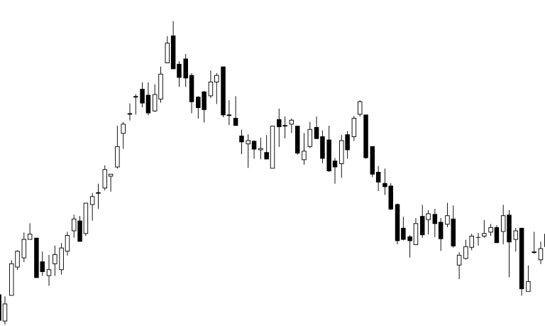
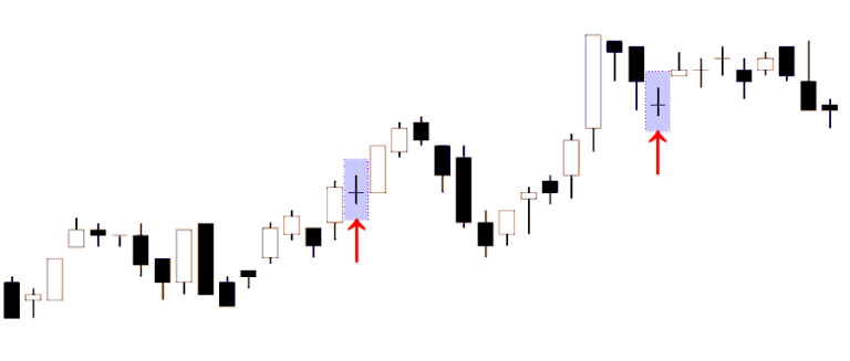
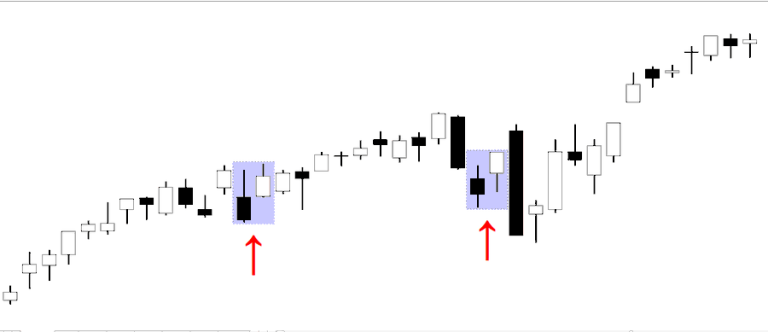
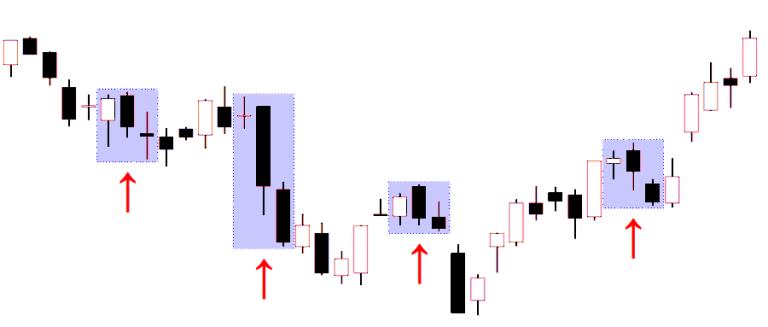
Candlestick charts are a way to visualize open, high, low, and close (OHLC) for each time period. Instead of a single line, you get a “candle” whose body shows the open-to-close range, and “wicks” (shadows) that show the high and low. The appeal is that one candle can summarize who “won” that session (buyers or sellers) and how messy the fight was.
Here is an example of candlesticks on a chart. The “body” is filled black if the close is lower than the open, and it’s white if the close ends higher than the open:
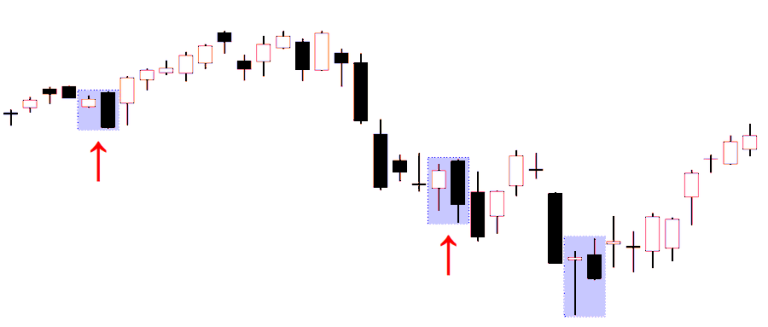
Candlestick patterns are then “named shapes” built from one or more candles. Traders typically use them as reversal or continuation signals, often as part of broader price-action analysis (trend context, nearby support/resistance, volatility regime, etc.).
A key point most glossy explanations skip: candlestick patterns are ultimately just rules on OHLC data. That makes them ideal for systematic testing, and it also means any “edge” they have should show up as a measurable difference in forward returns after the pattern appears.
Do Candlestick Patterns Actually Work? Evidence From Quantitative Backtesting
Academic findings are mixed, and the “candlesticks always work” claim does not hold up well once you test properly.
One of the most-cited robust tests on Japanese candlestick strategies in U.S. equities is by Marshall, Young, and Rose (2006). Using a bootstrap-based methodology designed to separate signal from randomness, they conclude candlestick trading strategies did not add value for DJIA stocks in their sample.
Other research finds conditional predictability can exist, but it often depends on how you define trends, holding periods, and exits. For example:
- Caginalp & Laurent (1998) report statistically significant predictive power for certain price patterns on U.S. stocks in their sample period, emphasizing that how you define patterns and compute profits matters.
- Lu (2015) focuses on what drives candlestick strategy profitability and highlights that trend identification and profit calculation rules can change results materially.
- Tharavanij (2017) explicitly studies candlestick pattern profitability and evaluates multiple holding periods (1, 3, 5, 10 days) and different exit styles, underscoring that “does it work?” is inseparable from “how exactly are you trading it?”
Stepping back, the broader technical-analysis literature argues results are highly sensitive to methodology, markets, and time period, which is exactly why you should treat any single chart example with suspicion.
Why Most Candlestick Pattern Examples Are Misleading
Most candlestick education is based on selected charts that look clean in hindsight. Three common issues show up again and again:
Cherry-picked examples. A pattern shown in a book or blog post is usually chosen because it “worked.” That tells you nothing about how often it fails or whether the average outcome is positive. This is one reason academic studies stress systematic testing and controls for data-snooping.
Hindsight bias. Once you know what happened next, it is easy to convince yourself the pattern “clearly” predicted it. The fix is to define rules before looking at outcomes, then test on large samples.
Turning pictures into rules is harder than it looks. Even basic concepts like “long candle,” “small body,” or “trend” can be encoded multiple ways, and different definitions can flip results. Research explicitly calls out this definitional sensitivity as a major driver of disagreement.
How We Backtested 75 Candlestick Patterns on the S&P 500
This section is the practical blueprint: what was tested, what data, and how we converted patterns into actual trading signals.
Universe selection
To keep this realistic and liquid, the backtest uses S&P 500 exposure via SPY (SPDR S&P 500 ETF Trust). SPY is a widely traded S&P 500 tracker and is one of the oldest U.S.-listed ETFs. Its history goes back to 1993 and is the oldest ETF still trading.
Historical data
We used daily OHLCV data downloaded from Stooq (a widely used source for free historical market data downloads).
In this dataset, SPY history begins on 1993-02-01 and runs through today (latest available at the time of download). All results below refer to this window.
Signal generation
Pattern detection was done using our own proprietary code. If you look at our shop, you can order the code.
Holding period testing
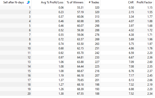
For each pattern, we tested holding periods of 1, 2, 3, 5,…. up to 20 trading days, consistent with how much of the candlestick literature frames short-horizon pattern effects.
Entry/exit convention (simple, reproducible):
- Detect pattern at the close of day t.
- Enter at that same close (a market-on-close style assumption).
- Exit at the close after H days (H in {1,2,3,5,,,,,20).
Slippage and commissions
Short-horizon edges are often small, so realistic costs matter. Backtesting guidance consistently warns that ignoring spreads, commissions, and slippage makes results look cleaner than they should.
In the combined-strategy test later in this article, we include a small transaction cost assumption (0.03% per trade) to demonstrate sensitivity.
Ranking Methodology: Profit Factor, Average Returns, and Trade Frequency
Patterns were ranked using a mix of:
- Profit factor (how much gross profit you make per unit of gross loss),
- Annualized return,
- The candlestick patterns with the highest combined averages ranked the highest.
What Is Profit Factor in Trading Strategy Evaluation?
Profit factor is widely defined as:
Profit Factor = Gross Profit ÷ Gross Loss
where gross profit is the sum of all winning trade gains and gross loss is the absolute sum of all losing trade losses. A profit factor above 1 means winners outweigh losers in total dollar terms.
Profit factor is useful because it forces you to look beyond win rate. A strategy can win only 40% of the time and still be profitable if the wins are much larger than the losses, and vice versa.
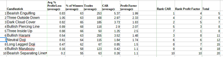
The 10 Best Candlestick Patterns Ranked by Historical Performance
Important context before the list: “best” depends on your constraints. A pattern with a very high profit factor but only 10–20 historical occurrences is not something you should bet your account on without additional validation (walk-forward tests, out-of-sample periods, and cost modeling).
Below are the ten patterns requested, with their observed performance in our SPY (1993-02-93 to today) backtest. Each line shows:
- Trades: number of occurrences that produced a trade
- Win rate: percent of trades with positive return over that holding period
- Avg return: average trade return over that holding period
- Profit factor: gross profit ÷ gross loss
- CAR: annualized return
We start with number ten and work our way up to the best-performing candlestick pattern in our tests.
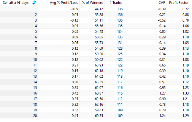
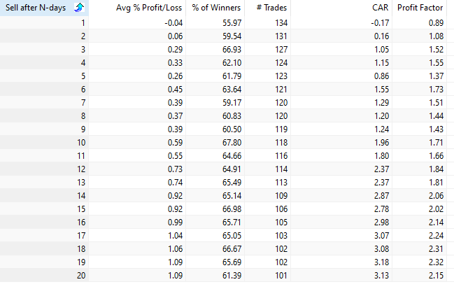
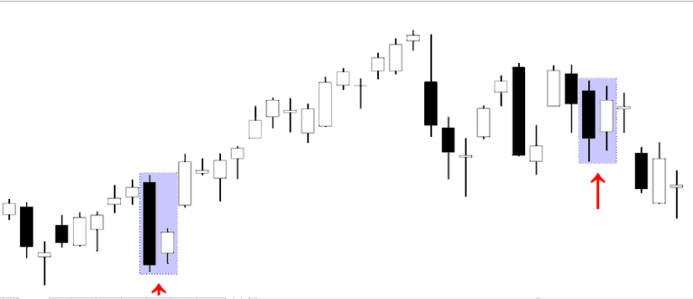
10. Bearish Separating Lines
The Bearish Separating Lines pattern is a two-candle formation.
It begins with a relatively strong bullish candle, followed by a bearish candle that opens at the same level as the previous candle’s open.
Despite its bearish name, the pattern actually produces a short-term bullish signal in the S&P 500.
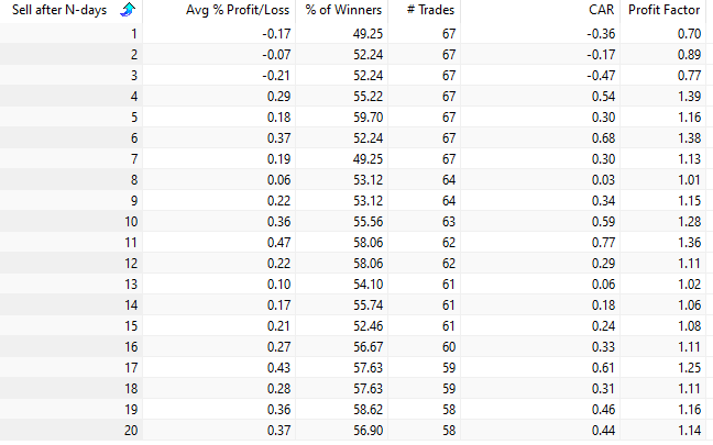
In our backtests, holding the market for ten trading days after the signal generated an average gain of 0.36 percent across 63 trades.
The pattern occurs relatively rarely, which limits the overall annual return. Among the ten patterns in our ranking, it also has the lowest profit factor.
9. Bullish Marubozu
The marubozu is a single-candle candlestick pattern that is easy to recognize.
It appears as a long candle with very small or nonexistent shadows. A perfect marubozu has no upper or lower wicks, although such examples are relatively rare.
Interestingly, the first few days following the signal tend to show slightly negative returns. Performance improves as the holding period increases, although much of that effect reflects the general upward bias of the stock market.
8. Long-Legged Doji
The long-legged doji is another single-candle formation.
It is characterized by long upper and lower shadows with a very small body positioned near the middle of the candle’s range. The structure reflects a strong battle between buyers and sellers and is often interpreted as a sign of market indecision.
In our tests, however, the pattern appears infrequently and produces only modest average returns.
7. Neutral Doji
The neutral doji forms when the opening and closing prices are nearly identical.
It can appear after both upward and downward trends and is often interpreted as a potential reversal signal.
In our backtests, the neutral doji performs roughly in line with the natural upward drift of the stock market. One advantage is that the pattern occurs relatively often, providing a steady number of trading signals.
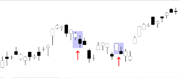
6. Bullish Harami
The bullish harami is a two-candle reversal pattern.
The first candle is bearish and relatively large. The second candle is smaller and bullish, with its entire body contained within the body of the previous candle.
Among the ten best candlestick patterns in our ranking, the bullish harami appears most frequently.
In terms of performance, the pattern shows a slight edge during the first few trading days, but the effect tends to disappear over longer holding periods.
5. Three Inside Up
The three inside up pattern consists of three consecutive candles.
The first two candles form an inside-bar formation, followed by a bullish breakout.
In our tests, the pattern produces above-average returns when the S&P 500 is held for more than ten trading days.
Over a 20-day holding period, the average gain is roughly twice the typical market return for the same timeframe. However, the pattern occurs relatively infrequently.
4. Bullish Piercing Line
The bullish piercing line is a two-candle continuation pattern that often appears during a temporary pullback within an existing uptrend.
Despite its bullish reputation, the short-term performance in our tests is relatively weak.
Over longer holding periods, the returns are roughly in line with the general upward drift of the stock market.
3. Dark Cloud Cover
The dark cloud cover is another two-candle formation.
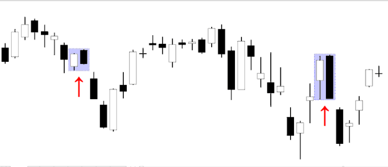
The first candle is strongly bullish. The second candle opens higher but then reverses and closes below the midpoint of the first candle.
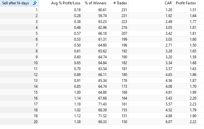
In our tests, this pattern performs well across both short- and medium-term holding periods. It also appears regularly enough to generate several trades per year.
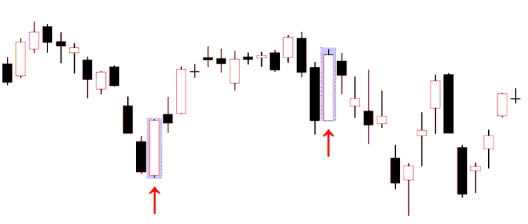
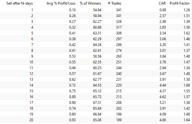
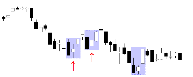
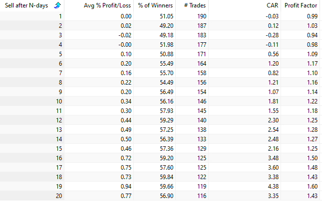
2. Three Outside Down
The three outside down pattern forms across three consecutive candles.
It typically appears after an extended rally and signals a potential reversal.
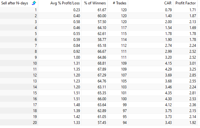
In our tests, the pattern produces strong short-term mean reversion. For example, three trading days after the signal, the average gain per trade is approximately 0.58 percent.
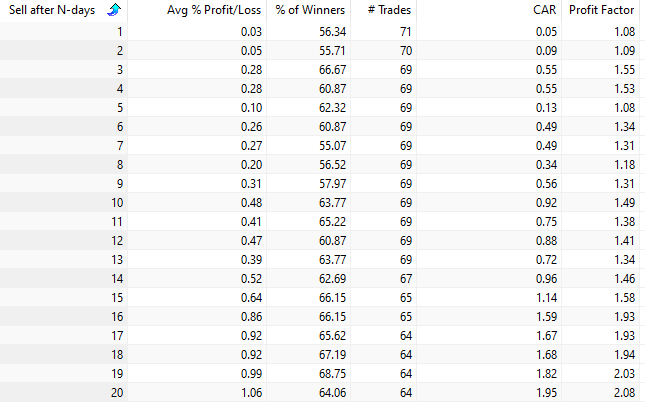
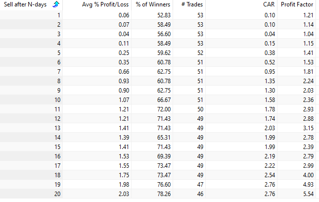
1. Bearish Engulfing — The Best Candlestick Pattern
The best-performing candlestick pattern in our entire study is the bearish engulfing pattern.
Despite its bearish name, it works exceptionally well as a bullish mean-reversion signal in the stock market.
Stocks tend to exhibit short-term mean reversion, which explains why many “bearish” patterns can produce profitable signals from the long side.
The bearish engulfing pattern consists of two candles: a bullish candle followed by a larger bearish candle that completely engulfs the body of the previous candle.
The pattern occurs relatively frequently and produces strong performance across multiple holding periods.
For example, if the market is held for five trading days after the signal, the average gain is approximately 0.46 percent. This is more than double the average return of a random five-day period.
The 10 Best Candlestick Patterns — Ranked by Data
We have now presented the ten best candlestick patterns based on our backtests.
All patterns were quantified, coded, and evaluated using historical market data.
While the patterns vary in both profitability and frequency of occurrence, they represent the strongest performers among the 75 candlestick formations we tested.
A Quantified Candlestick Trading Strategy Using the Best Patterns
This section turns “top patterns” into a single rule-based strategy you can actually evaluate.
Individual candlestick patterns can provide useful signals.
But the real power comes from combining several patterns into one strategy.
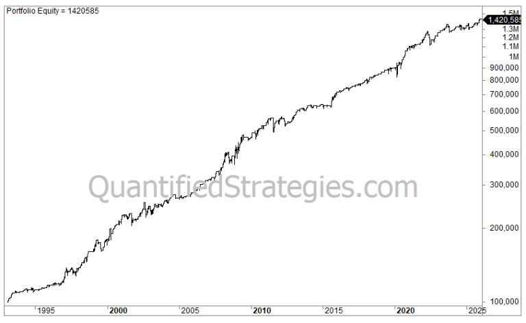
Backtest results of the combined candlestick strategy
When we combine the five best patterns and slightly modify the exit rule, the results become surprisingly strong.
Instead of exiting after a fixed number of days, the strategy exits when the close finishes above the previous day’s high.
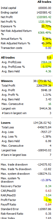
Starting with $100,000 in 1993, the strategy grew to roughly $1.4 million:
Key statistics:
- Average gain per trade: 0.5 percent
- Win rate: 74 percent
- Maximum drawdown: 13 percent
- Annual return: 8.3 percent
How to improve candlestick trading strategies with filters
Filters are where a lot of the “real” quant edge tends to live. This aligns with research emphasizing that trend definitions, entry rules, and exits drive profitability differences.
Common filters that are straightforward to test:
Moving average trend filter. For example, only take mean-reversion long signals when price is above a longer moving average (bull regime), or only take bearish-pattern snapbacks when the longer trend is still up. Studies explicitly note trend identification choices can materially affect candlestick profitability.
RSI filter. Dojis and bearish engulfing days often coincide with short-term oversold readings. Using RSI to restrict trades to “oversold” conditions is easy to test and may reduce false positives, even if it lowers trade frequency. (The point is not that RSI is magic, it is that context matters.)
Volatility filter. Candlestick rules can behave differently in high-volatility markets; a volatility filter can help avoid trading when spreads and slippage are likely to overwhelm small edges. This is consistent with standard backtesting warnings about slippage and cost sensitivity.
Market regime filter. Many technical edges are regime-dependent (risk-on vs risk-off). A simple regime definition (for example, price above or below a long moving average) is a common way to test this.
Do candlestick patterns work better in stocks than in forex or crypto?
Yes, candlestick patterns work better for stocks than for forex and crypto.
Why? Most likely because stocks tend to revert to the mean.
For crypto specifically, rigorous candlestick-pattern evidence is thinner and backtest validity is heavily impacted by 24/7 trading, exchange microstructure, and fees. Even in traditional markets, research and practitioner guidance warn that candle-based backtests can miss intraperiod movement and execution realities.
Limitations of Candlestick Pattern Trading
Low signal frequency is real. Some patterns are simply too rare to support strong claims. In our own test, bearish separating lines did not appear at all in the SPY dataset window, and several other multi-candle patterns occurred only a handful of times.
Systematic rules are not optional. Academic tests that take candlesticks seriously emphasize that you must specify trend context, entry timing, holding period, and exits. Small “definition” differences can flip conclusions.
Market regime dependence. A pattern might behave one way in a trending market and the opposite way in choppy regimes. Reviews of technical analysis place heavy emphasis on the instability of results across samples.
Costs and slippage can erase small edges. If your average trade return is a few basis points, realistic transaction costs will dominate. Backtesting guides repeatedly call this out, especially for high-turnover strategies.
Key takeaways from the candlestick pattern backtest
Candlestick patterns are not “fake,” but they are not automatically tradable either. The academic record includes strong negative findings (notably the bootstrap-based DJIA results) and also some evidence that specific rules can have conditional value.
However, our own backtests shown in this article shows that some candlestick patterns work really well and have returns much higher than randomness.
The practical edge in “candlestick trading” usually comes from combining patterns with context filters and realistic execution assumptions, not from memorizing names and hoping.
Conclusion: Are candlestick patterns reliable trading signals?
Candlestick patterns can be useful descriptors of price action, but the idea that they are inherently reliable trading signals is not supported in a blanket way. Well-known rigorous studies have found no value for candlestick strategies in some equity samples, while other research finds pockets of predictability that depend on definitions, exits, and market context.
Out of the 75 candlestick patterns we tested, half perform poorly. Also, some patterns have very few signals. Finally, many patterns work the opposite way to what the theory says.
If you want to use candlesticks responsibly, treat them as hypothesis generators: define rules precisely, test them with costs, require enough trades to trust the statistics, and assume the edge can decay.